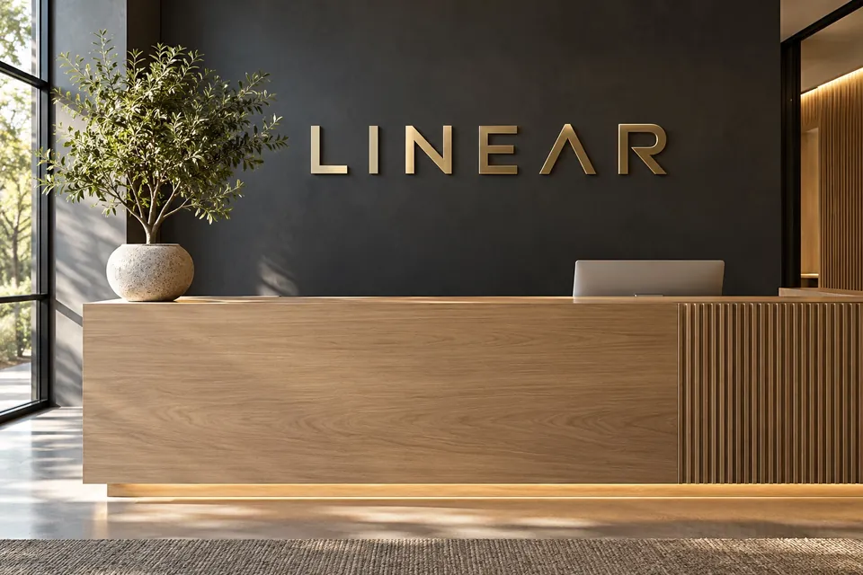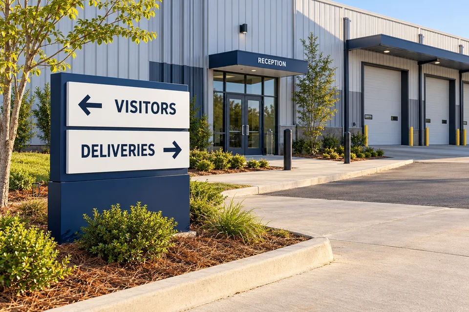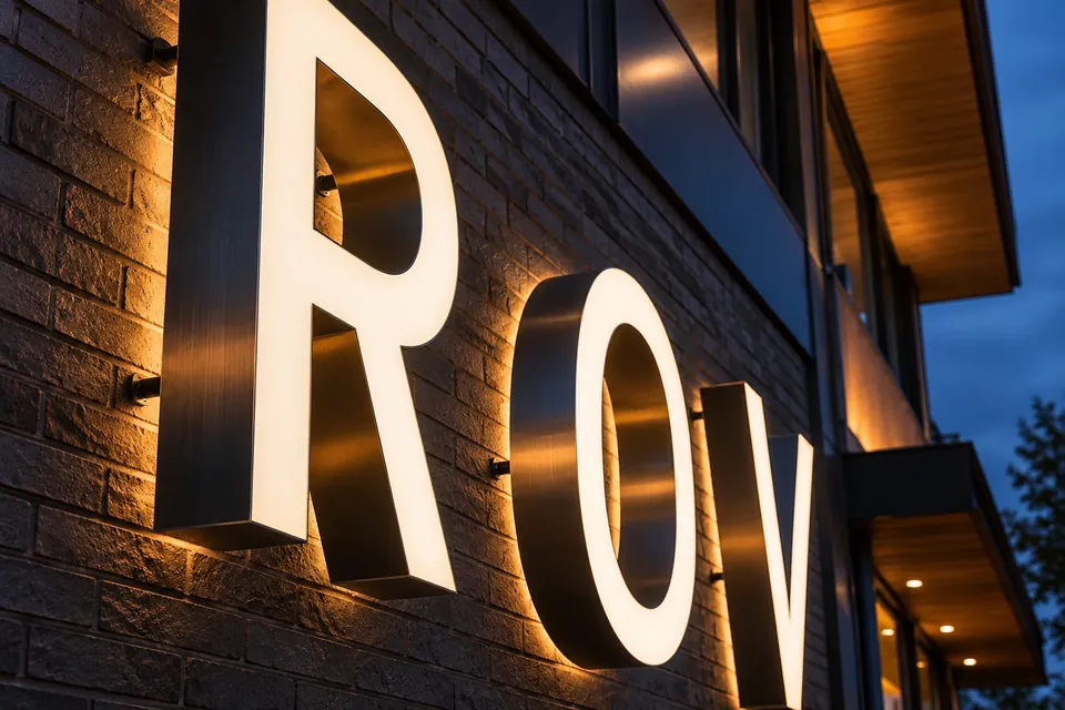
A restaurant’s name sign may be seen at lunch, at dusk and after the dining room lights are on. The same logo can appear very different in those settings. Rather than approving only a glowing evening rendering, compare how the complete name reads in ordinary daylight as well. A useful design conversation considers the lettering, the wall and the surrounding light together.
Photograph the same guest view twice
Take a daytime view and an evening view from a safe, representative guest approach. Keep the framing similar so the design team can compare the background and nearby light sources. Include the whole available sign area, not only a close crop of the existing lettering.
For restaurant signage in Boiling Springs, those paired photographs can establish a useful starting point without assuming any particular frontage. Add a direct view and an angled view if guests commonly approach along the building.
Test the name before adding more words
Use the approved business name as the first layout test. Consider whether the logo contains a small descriptor, fine script or closely spaced details that become difficult to distinguish in the available sign area. A sign version of a brand may need an approved simplified arrangement; that decision should involve the person responsible for the restaurant identity.
Compare the options at a similar apparent scale rather than enlarging one rendering until it looks more impressive. Ask what a guest should recognize first. The permanent exterior identity does not have to carry the menu, every service option or the full story of the restaurant.
Compare lighting appearances, not just a brightness promise
Illuminated channel letters can create a direct, recognizable name treatment. Different constructions and lighting arrangements produce different appearances, so ask for an explanation of the proposed system and what the artwork is intended to show. A rendering is a design aid, not a measured prediction of the finished installation.
Discuss the relationship between the letter face, returns, mounting arrangement and facade. If a halo appearance or another treatment is being considered, ask how the actual wall finish and installation conditions affect the proposal. Keep the decision tied to the desired identity and the site assessment rather than assuming that one lighting style suits every restaurant.
Keep daylight appearance in the approval
Turn attention back to the unlit view. Does the sign still feel like the restaurant when illumination is not contributing to it? Review the face color, edge treatment and visible mounting against the architecture. Nearby awnings, windows and neighboring signs should be shown in the context image where practical.
A building sign is part of a facade, not an isolated product photograph. The proposed letter arrangement should work with the usable wall space and remain understandable as a complete name. If an architectural feature interrupts it, resolve the layout before the fabrication proof is treated as final.
Use a simple approval sheet
Put the daytime and evening designs on one sheet with the same wording, dimensions and mounting position. Note any assumptions that still need confirmation. This makes it easier for the restaurant owner, brand reviewer and property contact to discuss the same proposal.
- Exact name and approved logo arrangement.
- Daytime and evening context images.
- Proposed construction and illumination approach.
- Site, power, access and approval items still to be confirmed.
Keep pickup directions, operating hours and short-term offers in a separate entrance-information plan. They should support the guest experience without crowding the primary name. To begin a restaurant sign quote, send the two frontage views, approved artwork and the appearance you want to compare. That creates a concrete discussion about recognition in the conditions your guests actually encounter.