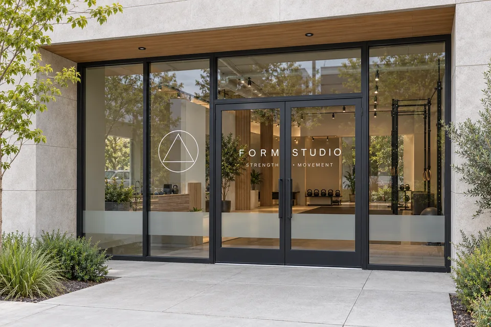
A fitness studio window often becomes the home for everything: the logo, class names, introductory offers, opening hours and instructions for a first visit. Each message may be useful, but putting them all at equal size makes the frontage harder to understand. A more effective brief starts by deciding what should remain recognizable all year and what will change as the studio’s schedule evolves.
Choose the one message people should notice first
For most studio frontages, the lasting identity is the natural starting point. Consider the approved name, logo and any short descriptor needed to explain the business. Review the actual panes, door positions and existing features before deciding how much of the artwork should span the glass.
For fitness signage in Woodruff, send a straight-on frontage photo and a view from each normal approach. Those images help compare a broad brand treatment with a smaller identity positioned near the entrance, without assuming that more coverage automatically communicates more clearly.
Give class information a flexible home
A detailed schedule can become outdated quickly. Decide whether the window should show the complete timetable, a small group of class categories or a route to current information. If a schedule must be displayed, give it a replaceable area with a consistent template and a person responsible for updates.
The stable identity and the changing schedule do not need the same material or production method. Discuss that difference when planning window graphics. Explain how often information changes, the intended display period and whether the studio expects to remove or replace the graphics later.
Plan the first visit as a separate message
A new client may already know which class they booked but still be unsure where to enter or check in. Look at the instructions sent with a booking. If guests are asked to use a particular door, arrive at reception or wait in a certain place, the entrance should confirm that instruction in the same language.
Keep this message concise and close to the point where it is needed. “Check in at reception” has a practical role that is different from an aspirational brand statement. A studio can sound like itself while still being direct about the next step.
Review the glass from inside as well as outside
Photograph the frontage with normal interior lighting and displays in place. Then review it from the studio side. The business may want to preserve an outward view, reduce visual distraction in a specific area or keep a reception desk visible. Describe those goals clearly rather than choosing a film from appearance alone.
Surface condition, existing treatments and the intended graphic coverage should be reviewed before a material is specified. Ask for a layout showing individual panes and door edges so important letters are not unintentionally split by frames. Include any areas that the property team says must remain clear.
Use a simple three-layer proof
Ask to see the design with only the permanent identity, then with entrance information added, then with a sample promotion. This reveals whether the everyday design still works when a temporary offer appears. It also creates a repeatable framework for future campaigns.
- Always present: studio name and agreed brand elements.
- Practical information: entrance, hours or first-visit instructions.
- Changeable message: a current schedule, event or introductory offer.
Continue the same vocabulary with interior reception and room signs, so the window and the studio feel connected. To request a fitness studio signage quote, share your logo, pane photographs, current booking instructions and an example of the information that changes most often. That is enough to begin a focused conversation about a frontage that welcomes newcomers and remains manageable for the team.