An automotive business can have one name and several customer experiences. Someone collecting a vehicle may want service reception. Another visitor may be looking for sales, and a third may need a parts counter. If the only prominent message is the business logo, the customer knows the company but may still choose the wrong entrance. Department identification deserves a deliberate place in the sign plan.
Define destinations from the customer’s point of view
List the departments customers actually visit and the wording used in appointments. Avoid starting with internal team names if the public does not recognize them. “Service reception” may explain a destination more clearly than a department abbreviation, but the right wording should come from the business’s real process.
A Gaffney automotive sign brief can map those destinations without assuming a particular building layout. Mark which entrances are public and which are staff or operational access, then have the business confirm the distinction before graphics are developed.
Give the business name and department different roles
The main identity establishes who operates the premises. The department label explains which part of the business a person has reached. Both should be recognizable without competing at the same visual weight. A repeating family of department signs can create order while the main logo remains the strongest brand element.
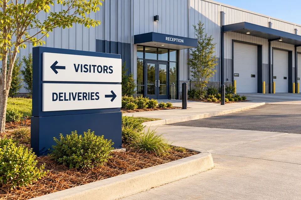
For building-mounted signs, compare the placement of the main name with the actual public entrances. Do not force a service label into leftover space simply because the facade already has a logo there. A department sign is useful only if it helps at the moment the customer chooses a destination.
Check the appointment-to-entrance handoff
Read an ordinary booking message and then approach the premises as a new customer. Does the message say “Service desk” while the sign says “Workshop”? Does the instruction mention a side entrance that has no confirmation at the door? Small language differences can make an otherwise simple visit feel uncertain.
Make a short comparison sheet with the appointment wording, the external sign, the entrance label and the indoor destination. Resolve contradictions before ordering new graphics. This also helps when a department moves temporarily during building work: all four touchpoints can be updated together.
Keep changing offers away from essential directions
Seasonal offers and promotional window graphics may be important to the business, but they should have a defined display area. If an entrance instruction is surrounded by competing price messages, the visitor has to search for the practical information. Review the frontage with current campaigns visible, not just an empty window photograph.
Vinyl and window graphics can carry opening hours, collection information or a short department label. Specify the intended duration and the exact surface so the material discussion reflects how the message will be used. Do not assume that every existing glass treatment should be covered or removed.
Approve the whole customer sequence
Ask sales and service staff to review the proposed sign family together. A department may look clear in isolation while conflicting with a nearby instruction belonging to another team. Where vehicle movement or restricted work areas are involved, the responsible site team must review the operational arrangement; the sign artwork should follow it.
- One approved name for each customer destination.
- Consistent department wording in bookings and signs.
- A clear distinction between permanent directions and promotions.
- Confirmation at the actual public entrance.
Our automotive signage overview brings those touchpoints together. For a sign quote, share the customer destinations, entrance photos and the most common question people ask when they arrive. That question often identifies the department message that needs attention first.