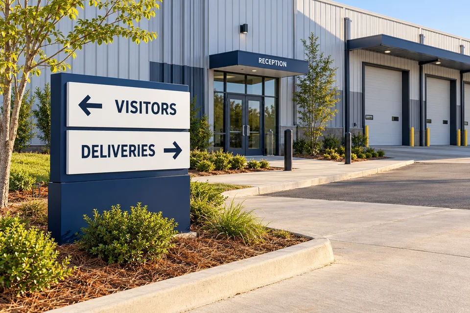
A delivery driver can recognize a warehouse and still be unsure what to do on arrival. The delivery entrance, check-in office and assigned destination may be different places. A sign brief should distinguish those stages before choosing panel sizes or adding another arrow. The goal is to communicate the facility’s current process clearly, not to create a traffic or safety plan through graphic design.
Start with the question the driver needs answered first
Ask the warehouse team what an unfamiliar driver should do before an individual delivery location is assigned. There may be a staffed check-in point, a designated contact method or another approved arrangement. Record the exact first instruction and the place where it should be read.
Do not begin with a long list of dock numbers if the actual first step is to report elsewhere. For warehouse signs in Greer, a useful brief can start with a photograph of the arrival view and one sentence describing that initial handoff.
Keep identity, check-in and assignment distinct
These three message layers solve different problems. The business name confirms the property. A check-in instruction explains the next action. A later assignment tells the driver where this particular delivery belongs. Combining all three into a permanent panel can create an instruction that becomes outdated as operations change.
- Identify: use the same facility name as the booking or dispatch information.
- Explain the first step: show the approved reporting point or contact instruction.
- Confirm the next destination: use the same location names and numbers the operating team gives drivers.
If a message depends on delivery type, appointment status or operating hours, have the responsible team define those distinctions. The designer can then arrange the wording without guessing how the warehouse should run.
Test the words against the messages already sent
Compare the proposed sign with delivery emails, appointment confirmations and carrier instructions. “Shipping office,” “Transport desk” and “Dispatch” may be familiar synonyms to employees but different destinations to a visitor. Decide on a primary name and use it consistently.
Check phone extensions, opening hours and any quoted location codes carefully. A clean sign with an obsolete number is still an unsuccessful sign. Identify which information is stable enough for permanent lettering and which belongs on an updateable panel.
Choose a format that supports changes
Post and panel signs may suit an outdoor message point when the location and installation approach have been reviewed. Door graphics or interior identification signs can confirm the check-in destination. A modular or replaceable message area may be worth discussing when tenants, departments or processes change regularly.
The format should follow the actual viewing position and site conditions. Collect photographs from approved observation points, and ask the site team to review any proposed sign location. Do not improvise directional arrows, vehicle routes or placement around operating equipment as part of an artwork approval.
Make the final review an operations review too
Give the people who handle deliveries a proof showing the exact wording and planned location. Ask them to read it as a driver who has never visited, then describe what that person would do next. If they need to add an explanation verbally, the sign may be missing a necessary distinction.
Finish with a short ownership record: who approves revisions, where artwork is stored and which other messages need updating when a destination changes. That small administrative step can prevent a new sign from becoming another old instruction left in place.
Bring the approved check-in process, arrival photos and existing dispatch wording to a warehouse signage quote request. The resulting scope can address the first instruction and its supporting signs without trying to replace the warehouse’s operating procedures.